

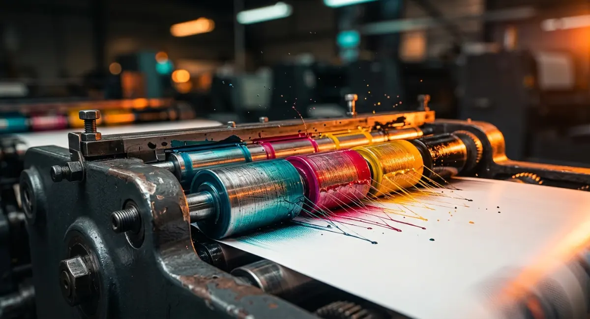
CMYK printing process: Why Professional Printing Depends on the Subtractive Model
If you have ever sent a design file to a modern printing press in Bangladesh and then stared at the printed result wondering where all the color went, you are not alone. It happens constantly. The screen looked great. The print came back looking flat, dull, or just slightly wrong. And most of the time, the reason comes down to one thing: the CMYK printing process.
This guide breaks down why CMYK works the way it does, what goes wrong when people ignore it, and what you can actually do to get better results. No jargon walls. No assumptions that you already know this stuff.
Part 1: The “Key” to Print – How the CMYK Model Actually Works
Subtractive vs. Additive Color: Why They Work Differently
Your phone screen and a printed brochure do opposite things with color.
A screen creates color by adding light. Mix red, green, and blue light together at full strength and you get white. Turn them all off and you get black. That is the additive model. RGB works this way.
Printing does the opposite. Ink absorbs light and reflects what is left back to your eye. Put cyan, magenta, and yellow ink on white paper, and each ink layer takes away some of the light. The more ink you add, the darker things get. That is the subtractive color model, which forms the scientific foundation for how CMYK works.
This is not a technical quirk. It is a fundamental difference. What works on a screen does not automatically work on paper, because the two systems are built on different physics.
Why Printing Needs Black Ink (The “K” in CMYK)
You might wonder: if you mix cyan, magenta, and yellow together, shouldn’t you get black? In theory, yes. In practice, you get a muddy brown.
Ink is not a perfect material. The pigments are not optically pure, and mixing all three colors at full strength produces something closer to dark mud than true black. The “K” plate, which stands for “Key” (historically referring to the key printing plate that carries the detail), solves this. It adds real black ink to the mix.
The K plate is what gives text its crispness and dark areas their depth. Without it, any fine detail in shadows would look soft and brownish. So no, you cannot skip the black ink and just mix the other three.
Halftoning: The Trick Your Eyes Fall For
Here is something that surprises most people. Your printer cannot actually print light blue. It can only print cyan, magenta, yellow, black, and nothing (white paper). So how does it produce hundreds of shades?
It uses dots. Tiny, microscopic dots printed at different sizes and angles. Where the dots are small and spaced far apart, the paper shows through and the color looks light. Where the dots are large and packed close together, the color looks dark.
When you hold a printed piece at arm’s length, your eyes blend those dots together and you perceive a smooth tone. This technique is called halftoning. The angles matter too. Each ink color is printed at a slightly different angle to prevent a visible interference pattern called a moiré. Get the angles wrong, and you can see the dot pattern as a texture rather than a smooth color.
Part 2: RGB vs. CMYK — Why Digital Designs Look Different on Paper
The Color Gamut Gap
RGB can produce colors that simply do not exist in the physical world of ink. Electric blue, neon orange, luminous green. These colors are created by light, and light can go bright in ways that no ink on paper can match.
The range of colors a system can reproduce is called its gamut. The RGB gamut is significantly larger than the CMYK gamut. When you convert an RGB file to CMYK, colors that fall outside the CMYK gamut get pulled back to the nearest printable equivalent. Sometimes the shift is small. Sometimes a vivid color becomes noticeably muted.
This is not a mistake or a calibration error. It is physics. The ink just cannot reflect that much light.
Light Emission vs. Ink Absorption
A screen glows. The pixels emit light directly into your eyes. That light feels rich and saturated because your eyes are designed to process it that way.
Paper reflects. Ink absorbs some wavelengths and reflects others back toward you. Even the best coated paper with the highest-quality inks cannot emit light. It can only bounce it. So colors that look vivid on a backlit screen will always appear somewhat less saturated when printed.
This does not mean print looks bad. It means print is different. Experienced print designers work within those limits and get great results. The problem comes when someone assumes the screen is accurate.
Screen Calibration Traps
Your monitor is almost certainly not showing you accurate print colors. Most consumer monitors display in a wider gamut than print and at higher brightness. What looks like a neutral gray on your screen might print as a slightly warm or cool gray.
There is a technique called soft proofing that helps with this. In design software like Adobe Illustrator or Photoshop, you can load an ICC profile for your specific printer or press and simulate how colors will look when printed. It won’t be perfect, but it gets you much closer to reality before the job goes to press.
Business like Printfo, one of the better-known printing and packaging operations in Bangladesh, typically work with ICC profiles and can share them on request. Using those profiles in your design software is one of the simplest ways to avoid color surprises.
Part 3: Why CMYK Matters — The Business Case for Color Consistency
The Recognition Factor
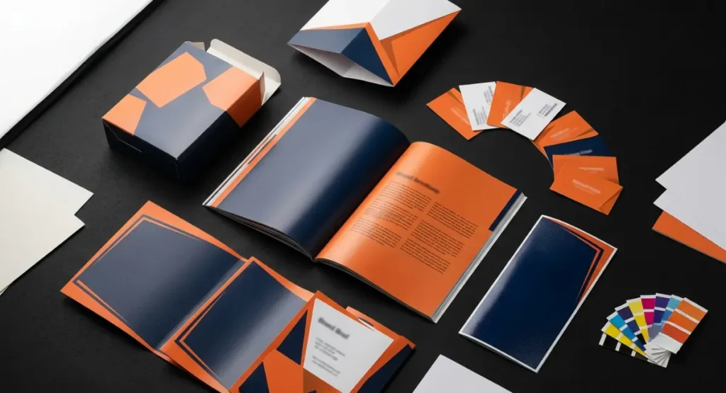
People recognize brand colors faster than they recognize logos. Research on visual identity has shown that consistent color use drives memory retention and trust. When someone sees your brand color on a business card, a brochure, a box, and a banner, and they all look the same, that repetition builds recognition over time.
When the colors do not match, something feels off. Even if the person cannot name the problem, they notice it.
Packaging vs. Collateral Disconnect
This is where a lot of brands quietly lose money. The marketing team orders brochures from one printer. The product packaging comes from another. Both are technically “on brand.” But side by side, the blue on the brochure looks cooler and the blue on the box looks warmer.
Customers notice this, especially in retail where your packaging and printed materials often sit right next to each other. The fix is not complicated, but it requires deliberately managing color across every printed touchpoint, not just approving each piece individually.
The Cost of Getting It Wrong
Reprints are expensive. Not just the ink and paper. The time to identify the problem, the delay to the project, the cost of rush jobs to replace bad materials.
Beyond direct costs, there is the softer damage: a product launch where the boxes look different from the promotional materials, or a sales deck where the brand colors look washed out. These things erode confidence in a brand slowly, and they are almost always avoidable with proper CMYK workflow.
Part 4: Professional CMYK Workflows — What Actually Makes a Difference
Rich Black vs. True Black
If you have a large black area in your design, like a full bleed black background, printing it as 100% K alone often produces a result that looks slightly gray or flat, especially in offset printing. The ink sits on the paper without the density to look truly dark.
The solution is a formula called rich black. A commonly used mix is 60C 40M 40Y 100K. This builds up ink density under the black layer and makes large dark areas look deep and solid. Some printers and press operators have slightly different preferred formulas, so ask your print provider what they recommend.
One caution: do not use rich black for small text. At small sizes, the multiple ink layers can cause slight registration shifts that blur the edges of letters. Use 100K for body text. Save the rich black formula for large headlines and fills.
Paper Stock Changes Everything
Coated paper has a smooth, sealed surface. Ink sits on top and colors look crisp and saturated. Uncoated paper is more porous. The ink soaks in, spreads slightly, and the result is softer and less saturated. This spreading effect is called dot gain.
The same CMYK file printed on coated and uncoated stock can look meaningfully different. If your job will print on uncoated stock, you need to account for dot gain either by choosing an appropriate ICC profile or by asking your printer how much compensation to build in.
Printfo, for instance, works across both coated and uncoated substrates and offers guidance on paper selection based on the end use of the printed piece.
G7 and ICC Profiles
G7 is a calibration method for printing presses. It standardizes how gray tones reproduce across different presses and different facilities. When a press is G7 calibrated, the neutral tones behave predictably, which makes color matching much more consistent.
ICC profiles are digital descriptions of how a specific press or printer handles color. When you design with the correct ICC profile loaded, your design software shows you a simulation of what that press will produce.
For any job where color consistency matters, asking your printer whether they operate to G7 standards and requesting their ICC profiles is worth the five-minute conversation.
The Color Grid Technique
Pantone colors are mixed inks. CMYK is a four-color process. They are not the same system, and converting between them is never exact. The standard Pantone-to-CMYK conversion tables are a starting point, not a guarantee.
One practical approach: before committing to a large print run, print a physical test grid. Pick your target Pantone color and print a grid of nearby CMYK values around the standard conversion. Under the actual lighting and on the actual paper stock, you can see which square comes closest. Then use that specific CMYK formula going forward.
It takes an extra step. It also saves you from printing 10,000 brochures in the wrong shade of red.
Part 5: Advanced Printing — Extended Gamuts and AI Proofing
Beyond Four Colors: CMYK + OGV
Standard CMYK covers most colors reasonably well. But some brand colors are genuinely outside its range. Certain oranges, vivid greens, and specific violets cannot be matched well with CMYK alone.
Extended gamut printing adds three more inks: orange, green, and violet (OGV). This approach is sometimes called 7-color process printing. It widens the range of reproducible colors significantly and allows brand colors that would otherwise be impossible in CMYK to be printed with high accuracy.
This is mainly relevant for large-scale packaging and brand-critical work. The presses and consumables cost more. But for a brand where a specific color is central to the identity, the accuracy is worth the investment.
AI-Powered Pre-Press Checking
Pre-press is the stage where files are reviewed before printing starts. Traditionally, this relied on an experienced operator reading through the file and checking for issues: low-resolution images, text too small to reproduce clearly, colors outside the printable gamut, thin strokes that will disappear on press.
Newer systems use predictive models to do much of this automatically. A file goes in, and the system flags potential problems before anyone has touched a plate. It does not replace judgment, but it catches a lot of obvious errors faster than manual review.
For high-volume operations, this reduces the rate of expensive mistakes and speeds up turnaround.
Cloud-Based Color Management
For companies that print across multiple facilities or multiple countries, keeping color consistent is hard. Each press is slightly different. Each facility has its own calibration. And when you are printing packaging in one location and point-of-sale materials in another, small differences compound.
Cloud-based color management systems let teams share approved ICC profiles, print specifications, and reference standards across facilities. When everyone works from the same profile, colors drift less between facilities.
Frequently Asked Questions
Why does my logo look different on my phone than on a business card?
Your phone screen emits light and can display colors in the RGB gamut. A business card reflects light and is limited to the smaller CMYK gamut. Some colors you see on screen simply cannot be reproduced with ink. The shift is also affected by your screen brightness and ambient lighting when you look at the card.
Can I just click “Convert to CMYK” in my design software?
You can, but the result is often not ideal. Automatic conversion moves colors to the nearest CMYK equivalent, which sometimes shifts colors noticeably. It also does not adjust your black text to 100K or handle rich black areas correctly. Converting manually with an ICC profile and checking the output is a much better approach.
What is the difference between CMYK and Pantone (PMS)?
CMYK mixes four inks on press using halftone dots. Pantone is a system of pre-mixed spot inks, each one a single, specific color. Pantone is more accurate for brand colors because you are using a known ink rather than approximating it from four components. The trade-off is cost and flexibility. CMYK works for full-color photography and complex illustrations. Pantone is mainly used for limited-color work where exact color matching is critical.
Why should I design in CMYK from the start instead of converting later?
When you design in RGB and convert at the end, you discover color problems after the design is finished. You may need to go back and adjust colors, tweak photography, or redo elements that shifted too much in conversion. Designing in CMYK from the start means you make those decisions as you go and there are no surprises at the end.
What is a “Rich Black,” and when should I use it?
Rich black is a CMYK formula that combines multiple ink channels under 100K black to create a denser, deeper black than 100K alone. A common formula is 60C 40M 40Y 100K. Use it for large black areas like backgrounds or bold graphic elements. Do not use it for small text, where the multiple ink layers can cause blurring at edges.
How do different paper types affect CMYK colors?
Coated paper produces sharper, more saturated colors because the ink sits on the surface. Uncoated paper absorbs ink and produces softer, less saturated results. This effect, called dot gain, means the same file will look different on each stock. Ask your printer for the correct ICC profile for the paper stock you are using.
What are G7 controls, and why do they matter for my business?
G7 is a calibration method that standardizes how printing presses reproduce gray tones. When a press is G7 calibrated, colors behave more predictably and consistently, and matching across different presses becomes much easier. If you are printing the same materials in multiple locations, G7 calibration at each facility significantly reduces color variation between them.